
My Attempt at DIY Contrast Paints
Ok, it’s time for me to come clean. I am a lazy painter. The guys who taught me how to paint were old school army painters. You know the type, they had thousands of figures in all scales and genres and made it a point of pride to have everything painted to a high tabletop standard (meaning how good do they look from tabletop height, roughly an arm’s length away). So their approach became my approach, and I built my workflow around cutting corners and getting models done.
Fast forward almost 20 years (my god, really?!) and enter Contrast paints. For those that aren’t familiar, these are advertised as a paint you can apply in one thick coat that settle and stain in such a way that they mimic shadow, basecoat, and highlight all in one go. Similar to painting with color washes but more highly pigmented, these paint stain products can be so easy to use that they sometimes feel like cheating. If you’re looking to get models done quickly and to a consistent standard, they (and similar products) are just the thing. If I’m being completely honest here, had these been around when I started miniature painting, I don’t think I ever would’ve used anything else.
But there’s a catch; this convenience comes at a price. These colors are not cheap and I already have a lot of paints. Surely I can figure out how to make my own, right? How hard can it be, he said. Famous last words.
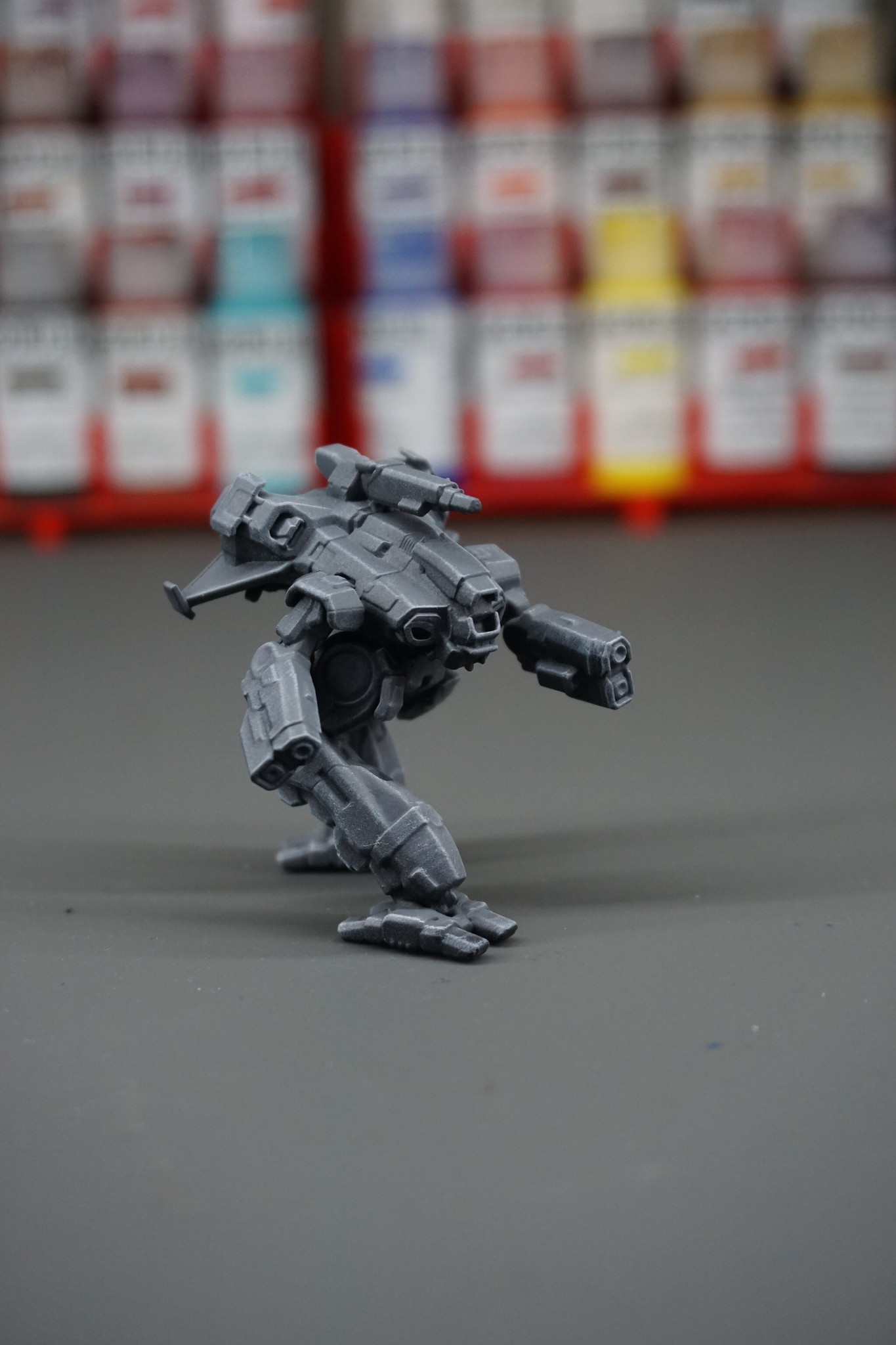
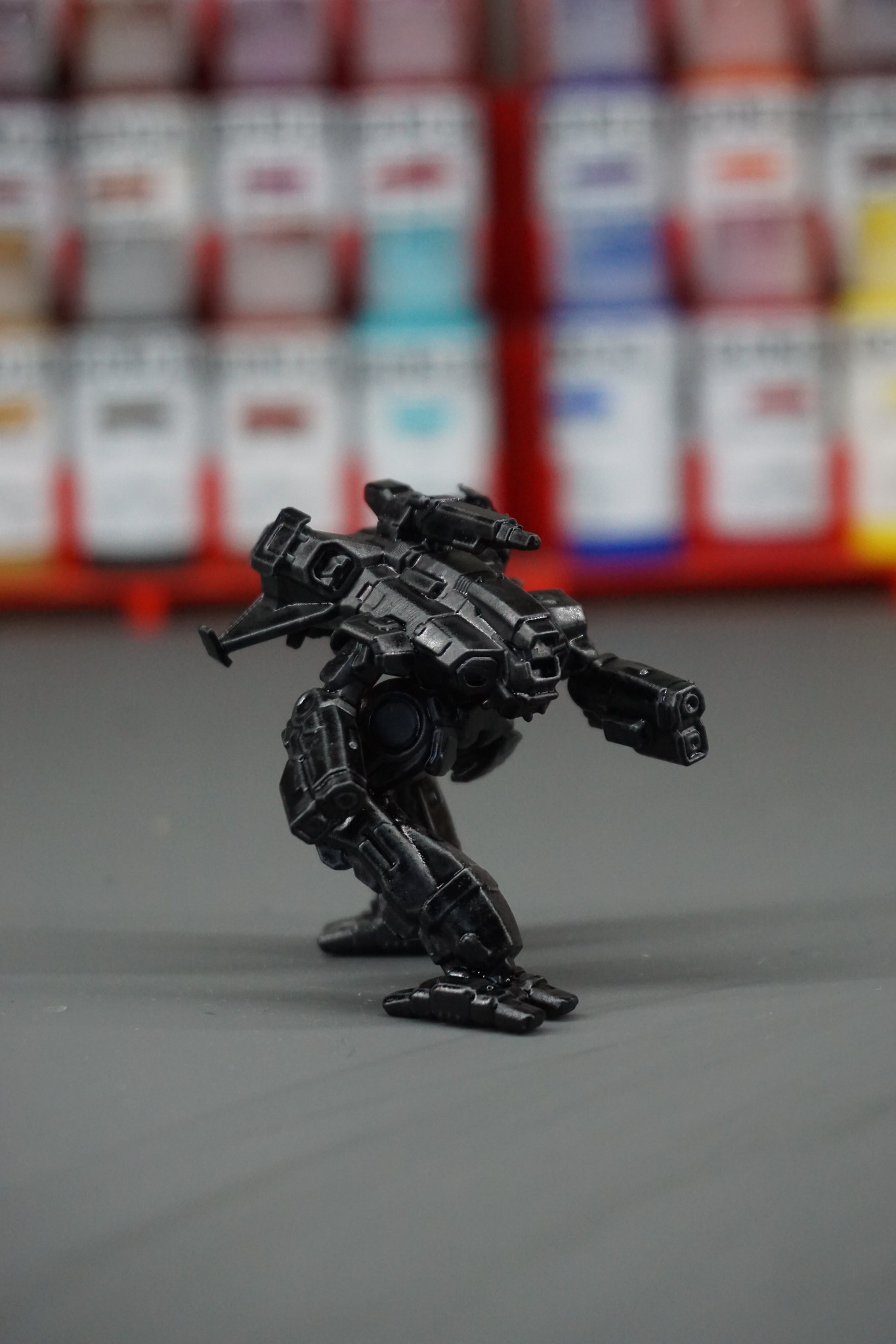
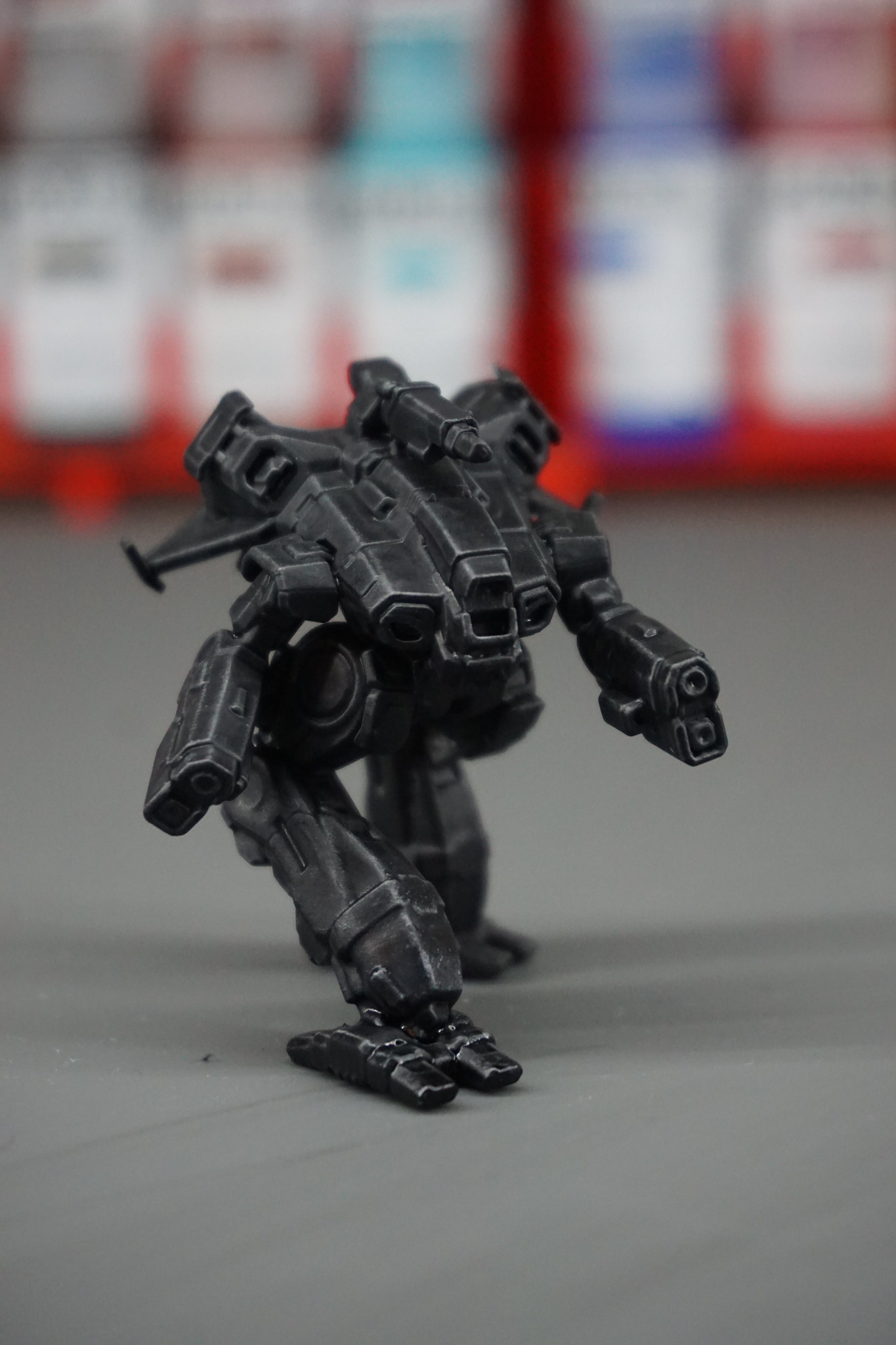
For this experiment I am going to use this 3d printed Marauder II, my favorite mech from Battletech. The commercial paint stains recommend using a pale primer or basecoat to get the most out of their staining properties, but I have decided to do this the hard way. My goal is to paint this mech in black, so I am starting from a black primer (Stynylrez Black).
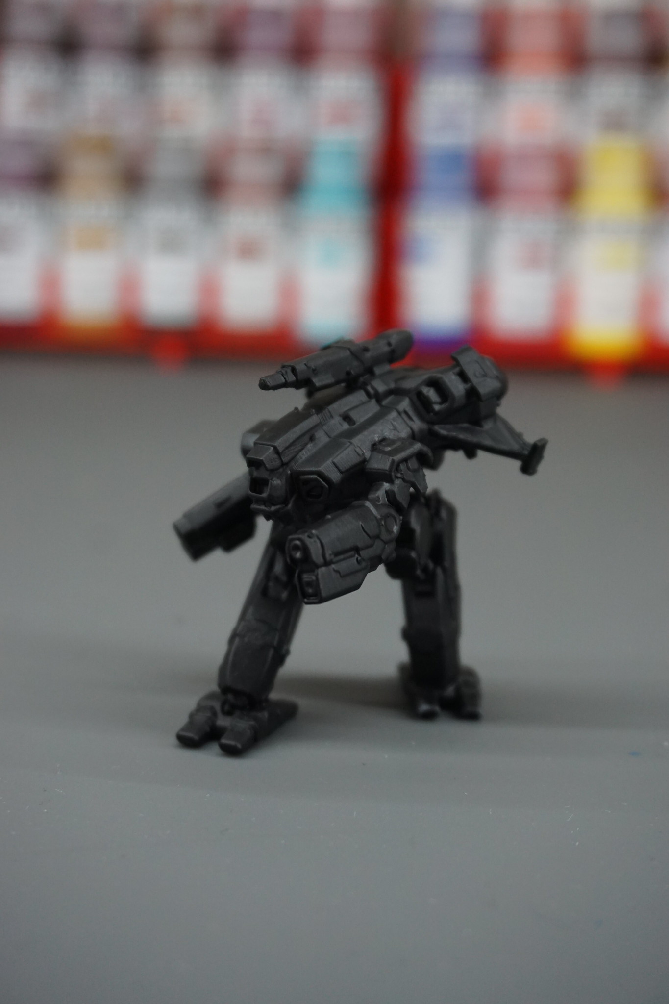
When that had dried, I used my airbrush to spray a zenithal highlight of grey primer. What that means is, I held my airbrush at a roughly 45 degree angle to the top of the model and sprayed down, imitating how light would hit the model. The top would be grey, but the underside would still be black. (FYI you don’t need an airbrush for this, a spray can works just fine here)
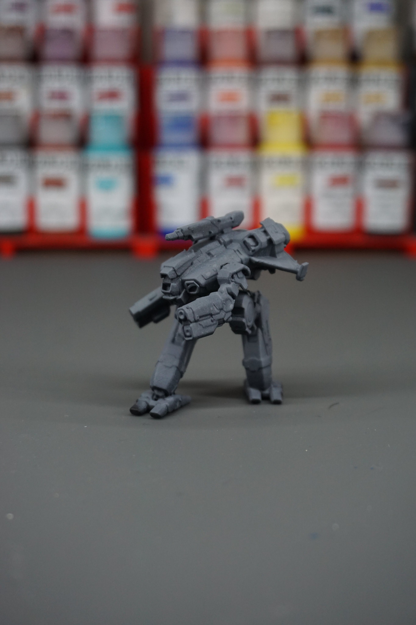
Finally, I wanted the hard edges of all those armor plates to stand out, so I took an old makeup brush and lightly drybrushed some white over the entire model.
Now comes the fun part. If you will allow me to put on my old man hat for a moment, back in my day, modelmakers sang the praises of something called Future. It was only later that I found out Future meant Future Floor Polish and these people were covering their models in… floor varnish? What the hell? But here’s the thing about Future (or Klear if you’re in the UK), it’s an acrylic gloss varnish that’s full of surfectants and flow aids to make sure it spreads itself flat and level. At some point, some brave modelmaker thought, “I wonder what would happen if I put paint in that?” Sort of like the guy in The Last Jedi that licked that salt planet, I imagine everyone looked at him the same way.
But here’s the thing. If you add acrylic ink to Future, all that flow aid turns it into an incredible wash. Slap it over the whole model and the heavier ink pigments are pushed into all the cracks and recesses, super easy. Suspiciously easy. What would happen if I didn’t add as much Future and left the pigment more concentrated?
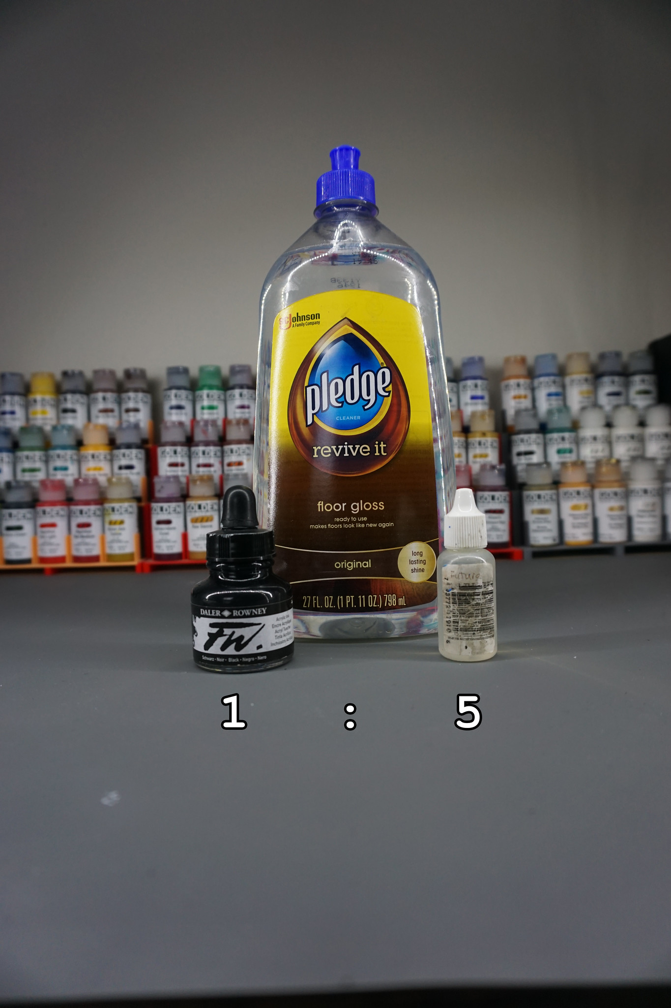
Dave, that’s not Future. That’s Pledge Revive It Floor Gloss (not a sponsor). Would you believe it’s the same thing? Pledge bought Future years ago and with every new rebranding they remove just a bit more of the old Future branding, but this is the same stuff. If you aren’t sure where to find it where you are, just search Amazon for “future floor polish” and whatever floor gloss comes up where the reviews are from modelmakers is the one you’re looking for. Do a Ctrl + F for “canopy” and you’ll know you’re on the right page.
To keep myself from making a huge mess and to make measuring ratios easier, I have decanted Future into a dropper top bottle, the same as you’d find with Vallejo or Army Painter hobby paints. I admit it was a guess and I only did one small test first, but I tried it with 1 part black ink to 5 parts Future. In the palette it flowed well and looked thin without looking like a wash, so it was time to slather it all over the model.
One of the advantages of commercial paint stains is they dry reasonably matte. Acrylic ink in floor gloss, unsurprisingly, does not. One coat of matte varnish later (I used Varnish+ from Instar, my favorite matte varnish) and it’s looking much better!
Ok, I’m so pleased with how this looked, right? The lines are subtle but clear. From the table you have clear separation of all the different elements and parts of the mech and it is still unmistakably black. Exactly what I wanted!
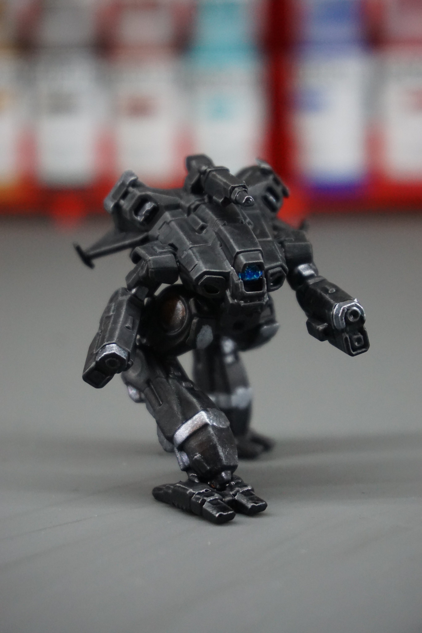
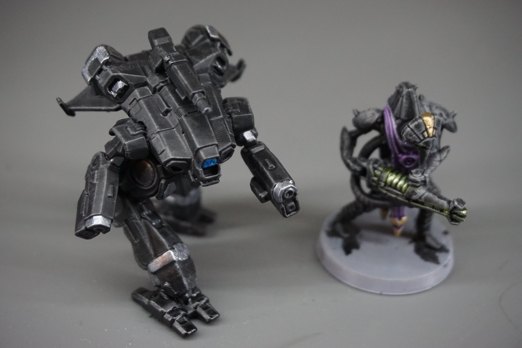
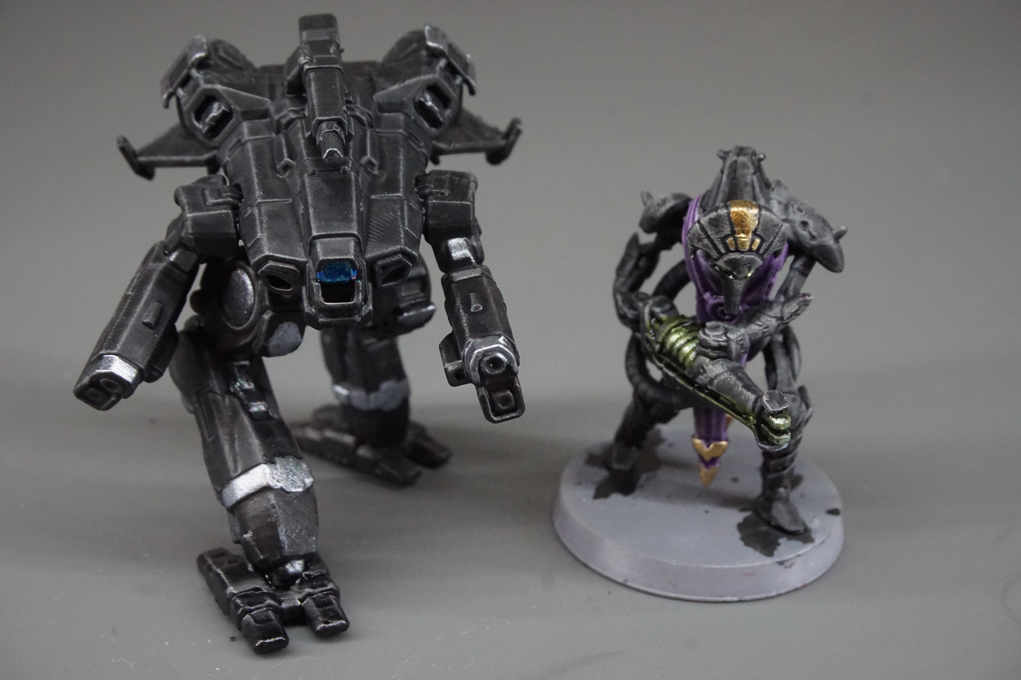
One thing I noticed after adding the metals and the brighter cockpit was that the subtle edge highlights weren’t as noticeable from the table any more. The brighter silver areas were so bright that my eyes had trouble discerning the darker panel edges, flattening the overall impression of the model. It still looked good, but it was a bit of a bummer compared to how excited I was after the previous step.
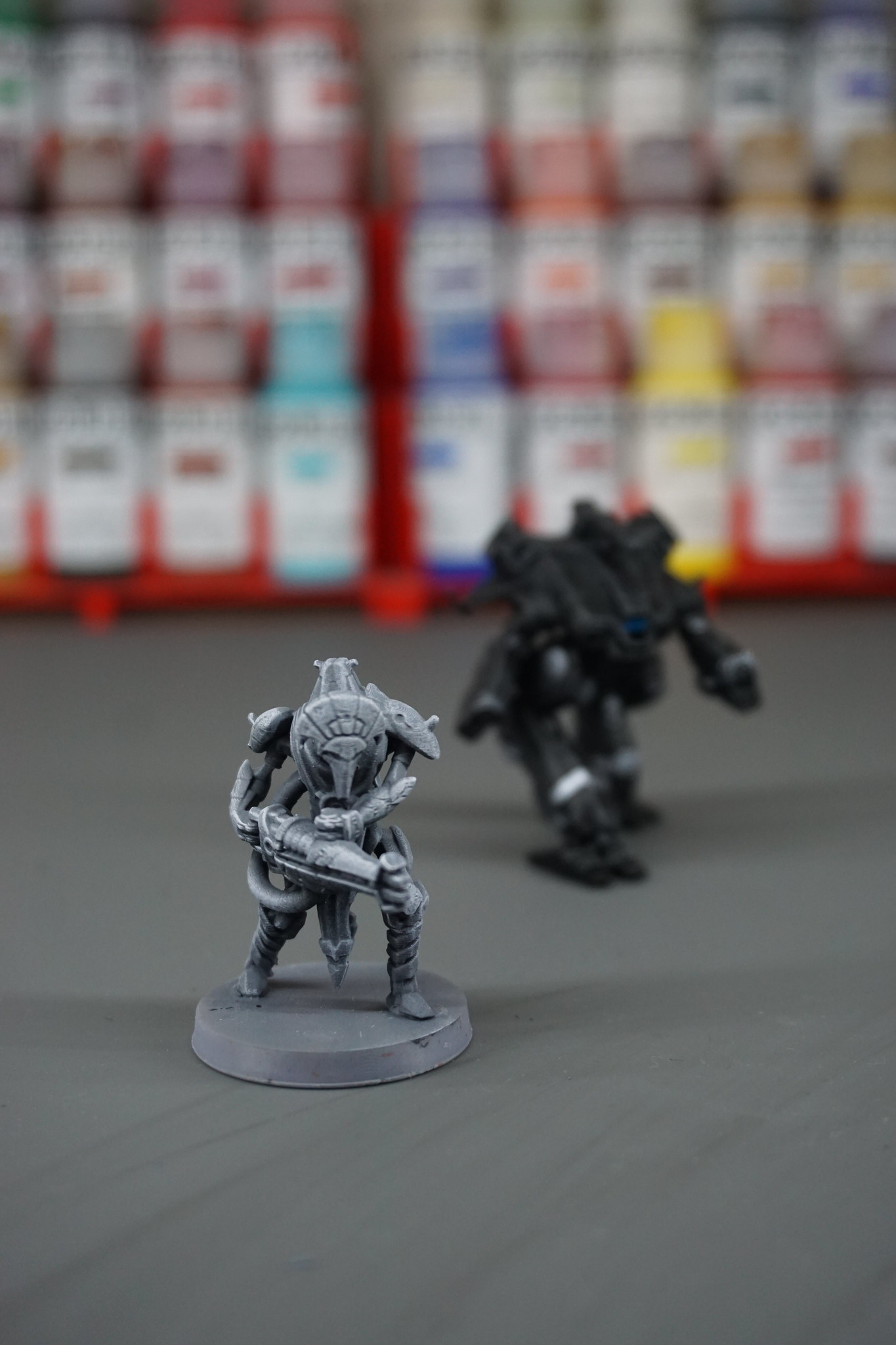
Let’s give it one more try. This time I added more Future to dilute the stain and let more of the primer color show through. I prepped a robot warrior from onepagerules in the same way as the Marauder II. Black primer, zenithal spray of grey, then a drybrush of white to pick out the sharp edges.
This time the ratio was 1 part black ink to 7 parts Future and, just for fun, I grabbed some purple ink to paint his toga. That was thinned 1 part purple ink to 5 parts Future.
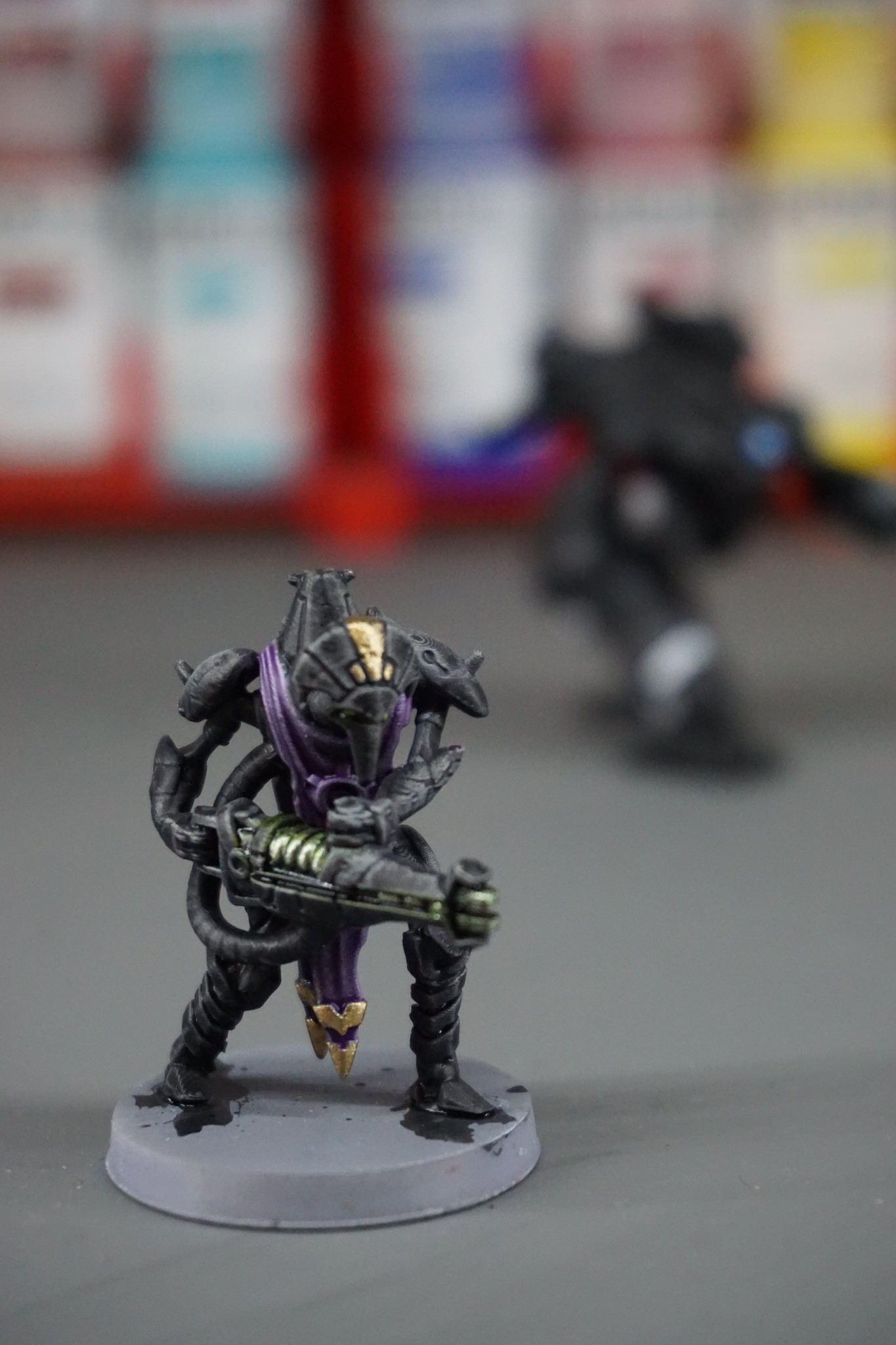
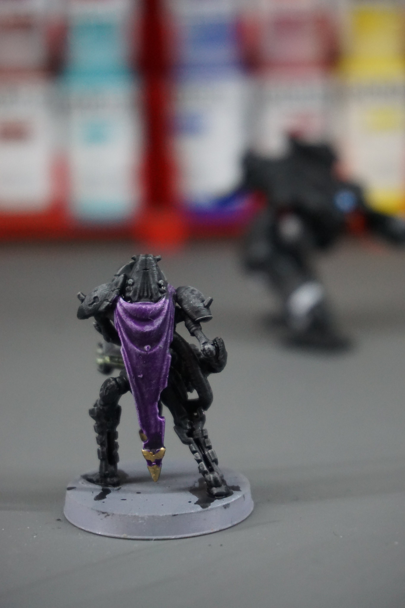
I feel like this is closer to the commercial paint stains and using the more diluted inks seemed to still pop after the other details were painted. While I may not have gotten them perfect, I feel like I’m definitely in the ballpark on this.
So there you have it! Will I use this all the time? Probably not, but I had so much fun experimenting here that I will definitely keep playing with it. This was a fun puzzle to attempt and I’m pleased with the results!
What do you think? Is this something you’d be interested in trying? Do you have a better way to make paint stains? Let me know! If you try this, please post a picture and tag me.
A few final thoughts before I let you go:
I feel like a 3:1 ratio of Future to ink is a good place to start, just add more Future to adjust coverage. The more Future you add, the more transparent the color will be. Using different color basecoats will also change how much you should thin the inks down. If you use a lighter primer, that will impact how much you need to thin the color, and how much you thin will change from color to color, as each ink has its own opacity. Also aren’t limited to single-color inks! You can mix colors to find exactly what shade you’re looking for, then add Future until it works for you.
Future does have an odor. I personally don’t find it to be an issue, but use your best judgement and always follow safety precautions. Be sloppy with your painting, not your health.
And if you’re concerned about price, the bottle of Pledge Gloss was ~$10 for 798ml and the Daler Rowney inks are ~$6 for 29.5ml, whereas Contrast paints run you ~$8 for 18ml, so that’s, um, quite a bit of a savings.
Be good,
-Dave
drives me crazy