Iron Man Mk 1
Building off of what we talked about last week, I’m finding myself just… practicing. Not trying to get anything in particular, and not really stressing about the finished results. I mean, don’t get me wrong, the shots aren’t terrible, but they are definitely rough. I wouldn’t include it in my portfolio or, under normal circumstances, show them to anyone. However, since you guys are my confidants on this creative journey, I feel like it’s ok to show you.
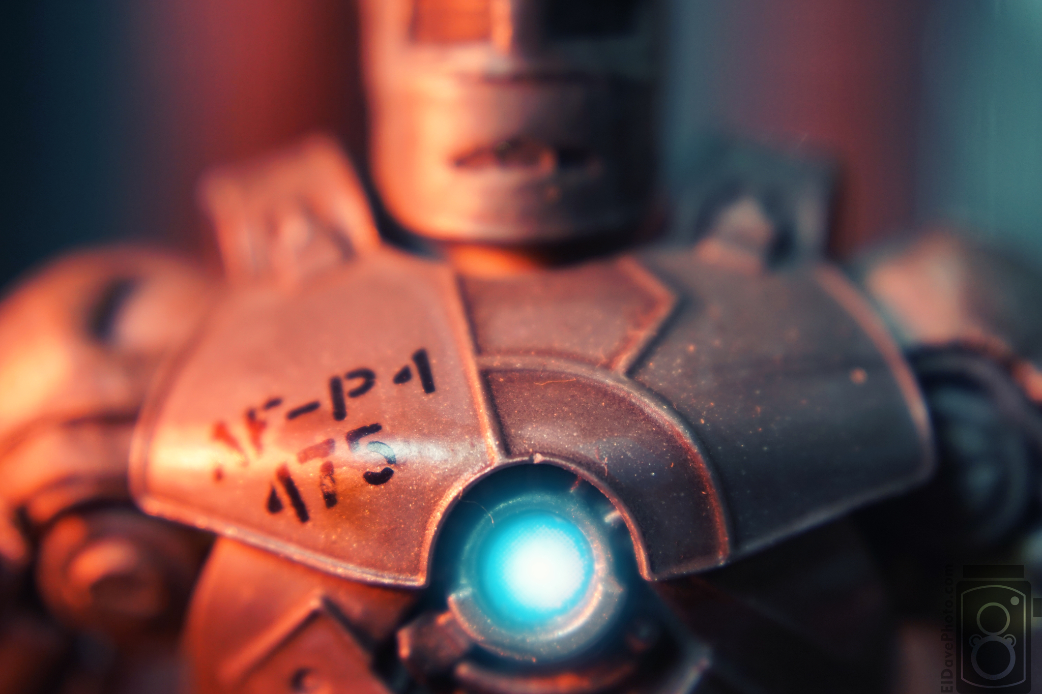
With the large center mass, shallow depth of field, and the glowing arc reactor, I wanted to focus your attention right away. Hopefully your eyes start on the blue glow, working their way up the figure to the stenciled text on the chest, and finally up to the blurry metal face. The red and blue lights are there for contrast and to make the otherwise grey metal figure interesting. Hot and cold repeating patterns.
What would I change? I would like to reshoot with the arc reactor centered along the bottom line, eliminating the empty space beneath the armpits and bringing the full triangle shape out across the shoulders and up to the top of the head. In the empty space above and behind the shoulders I’d like to use a deeper depth of field and have some sort of structure in the background.
So that’s it for this week. Not a great image, but it was great fun to make.
Be good,
-Dave
build something